
Typetanic sets sail on TN
Lucas Czarnecki: If you can remember a specific moment, when and why did you become interested in type design?
Gregory Shutters: When my family got our first computer, I was enamored by the built-in font choices and the ability to choose one to suit your mood or personal aesthetic. I recall “Modern No. 20”—a Scotch/Didone typeface pre-installed on our computer—was a favorite during this time.
My interest in designing my own typefaces started in college. I started out as a Broadcast major but started to gravitate towards graphic design when I started to make title graphics for the campus TV shows. When I decided to go down that route, I realized my university didn’t have a graphic design program. I ended up taking a few classes at the nearby art school for some transfer credits and got a part-time job designing ads for our campus newspaper. Of course, there was no budget for anything, and for fonts our options were the system defaults or what we could find on free font websites. For what I was trying to design, the defaults weren't capturing what I wanted to convey. I didn't like any of the free options either, but at the time, I couldn’t figure out why. That’s when I really started thinking about the details of type design, and what made a font good or bad—both on an objective level (whether it’s well made) and on a subjective level (whether a font will work in a certain context).
LC: What's the story behind your first published typeface?
GS: My first published typeface was called Columbia Titling, which I released in 2013. I was doing graphic design and social media full-time for a small non-profit, but in my off hours I was toying with a design loosely based on lettering found on an old Detroit steamboat. Suddenly my hours got cut back to part-time, and—faced with decreased cash flow and those famous New York City rent prices—I figured I’d see if there was a market for my type. I was both shocked and thrilled to see Columbia Titling not only sell, but also win a TDC award that year.
LC: About that steamboat… how did you pick the name Typetanic?
GS: I’m a bit of a historic-ocean-liner-buff, which you can see from my first three releases: Columbia Titling, Transat, inspired by lettering from a 1930s French ocean liner terminal, and Gibbs, inspired by signage from the 1950s luxury liner SS United States. “Typetanic” popped into my head as a foundry name years before releasing a font, fitting my love of both ships and puns. Hopefully the association with RMS Titanic doesn’t provide too much of a bad omen.
LC: Where do you find your major sources of inspiration?
GS: The vast majority of my inspiration comes from historic lettering: Architectural signage, antique labels, etc. Until relatively recently, most design work that is now done with digital fonts would have been done by hand, and I consistently find interesting shapes in old lettering that never “made it” to the digital age. Given my interests, a lot of this centers around transportation. As I mentioned, my first few releases were inspired by lettering on historic ships, but my most recent, LaFarge, is inspired by historic tile lettering in the New York City Subway. I have some others that I'm working on that also take inspiration from old theater signs and 1940s chrome car emblems.
LC: Do you have a favorite example of seeing your type in the wild? What do you hope designers use your typefaces for?
GS: My favorite example of spotting my type in the wild was a few years ago, when I was back in my hometown of Milwaukee. I grew up there and went to college there, and frequently admired this old building not far from my college campus downtown. It’s not very big, but it is distinctive. It’s called the “Iron Block,” as its ornate façade is made entirely from cast iron, and was built in 1860.
I had come back to visit family and happened to walk around that neighborhood. To my delight, the Iron Block had recently undergone a massive restoration—and has new signage set in one of my typefaces! I had no idea until I was literally standing in front of the building.
LC: What does it mean for you to be joining Type Network?
GS: I’m thrilled to be joining Type Network, primarily because of TN’s focus on maintaining strict quality standards. It’s quite an honor to be included! It’s also so easy to get lost within a vast 100,000 font library, and I like that Type Network spends the time and resources to select type, do quality assurance, and market their library.
LC: What's next for Typetanic?
GS: Since I started Typetanic I’ve been treating it as a bit of a “side project,” continuing to work full- or part-time in random design or design-adjacent jobs simultaneously. My hope for 2022 is that I can devote more of my time to type design, both expanding my current families to additional styles and weights and releasing my backlog of unfinished projects.
Typetanic joins TN with three excellent faces:
LaFarge
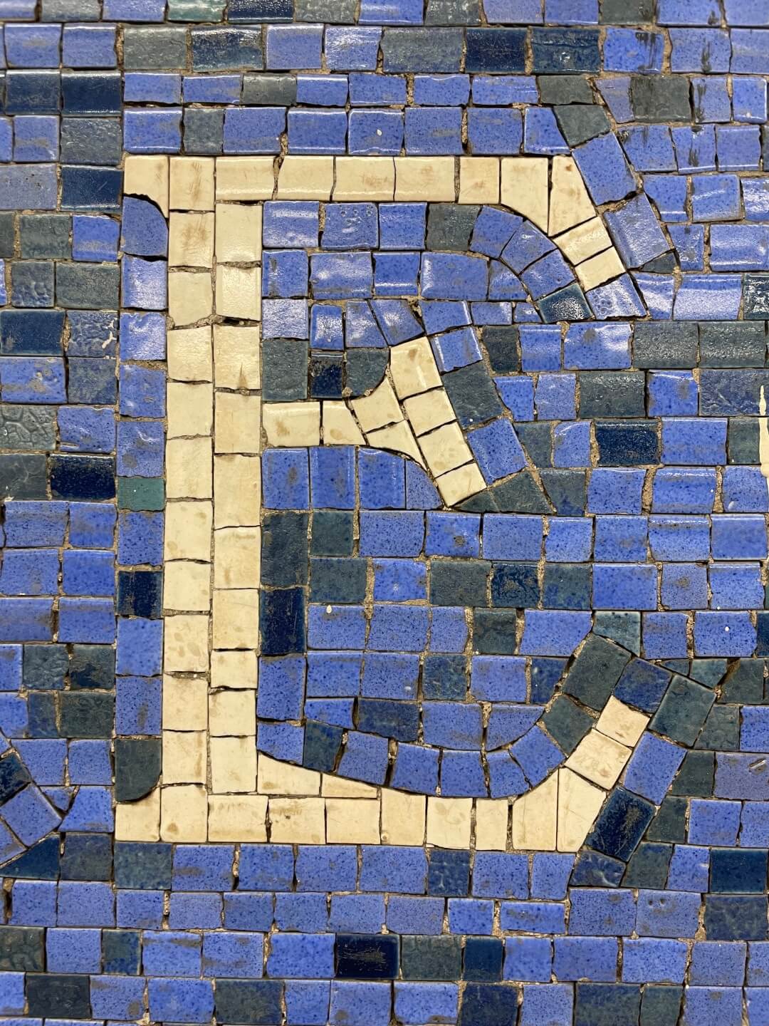
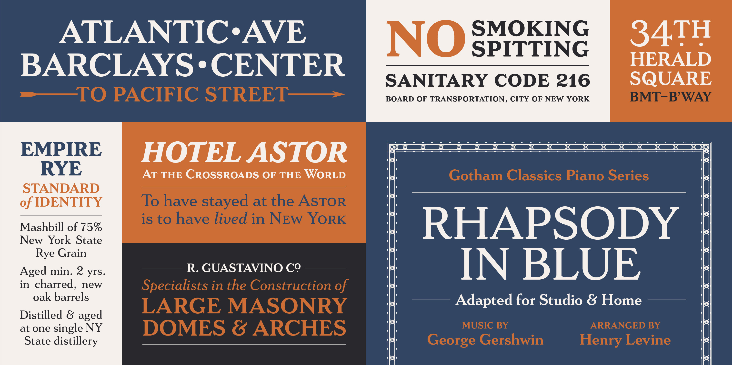
LaFarge is inspired by the mosaic capitals found in many early New York City Subway stations, featuring their distinctive high-waisted crossbars, elegantly curved “R” leg, and distinctive trapezoidal serifs. The result is a fashionable, architectural typeface that works just as well on the façades of grand public buildings as it does on packaging, magazines, or the web.
Gibbs
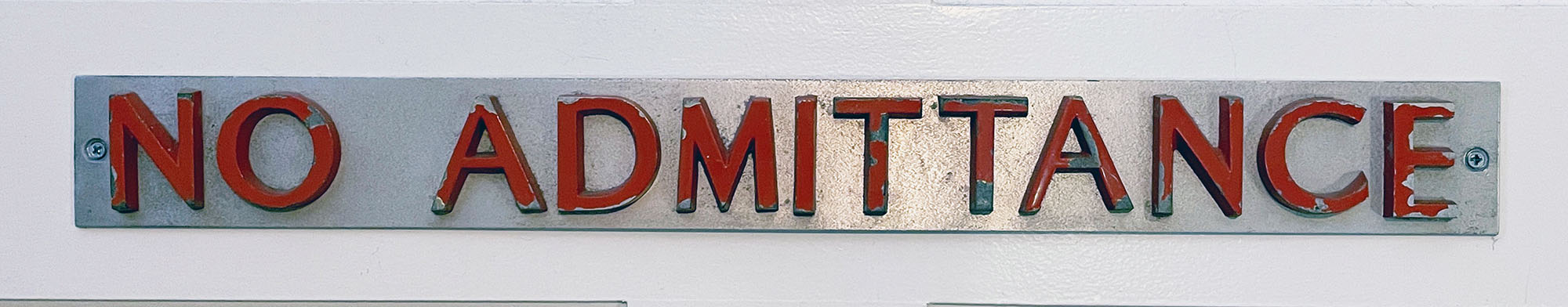
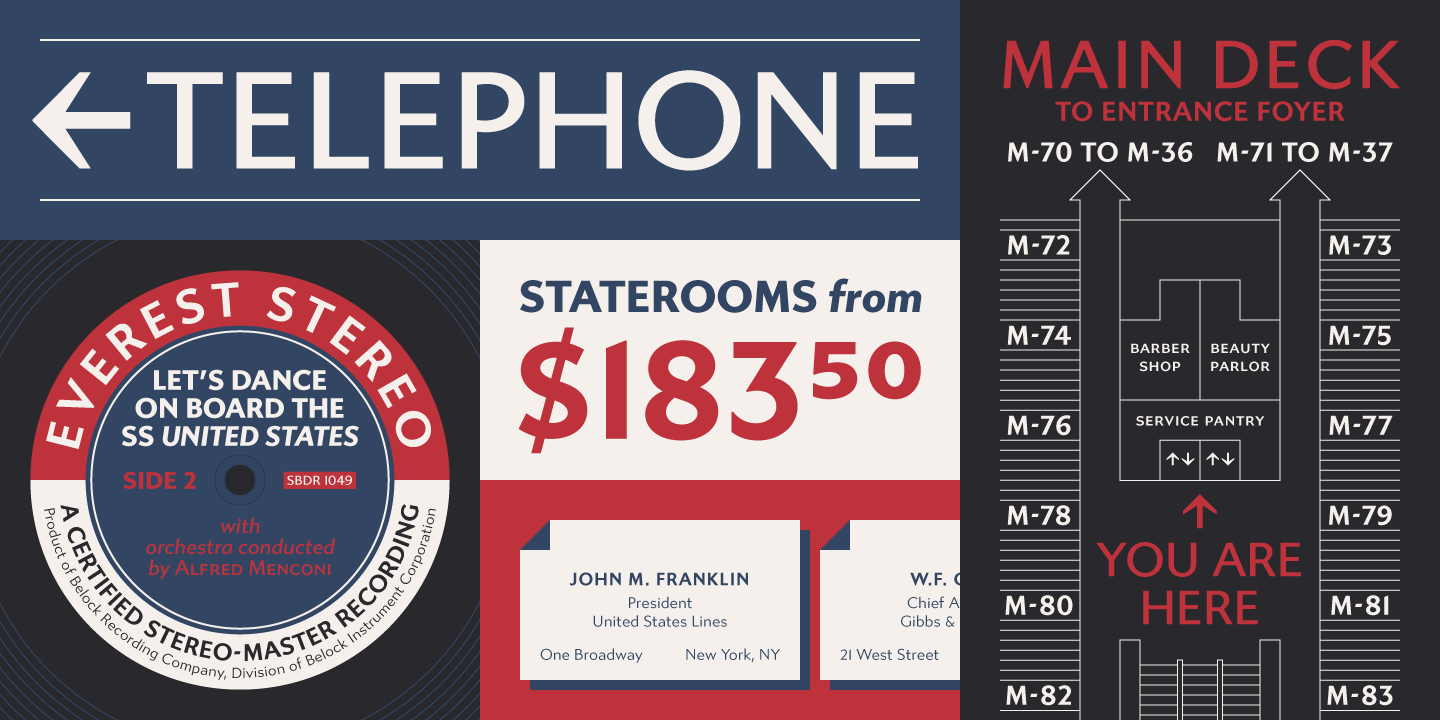
Gibbs is a tough, sophisticated sans, inspired by the unique cast aluminum signs found on board the 1950s luxury liner SS United States and named for its designer, William Francis Gibbs. The design is appropriately transatlantic, somewhere in between industrial American vernacular lettering and English humanist styles. The result is both uniquely stylish and comfortably readable in both text and display sizes.
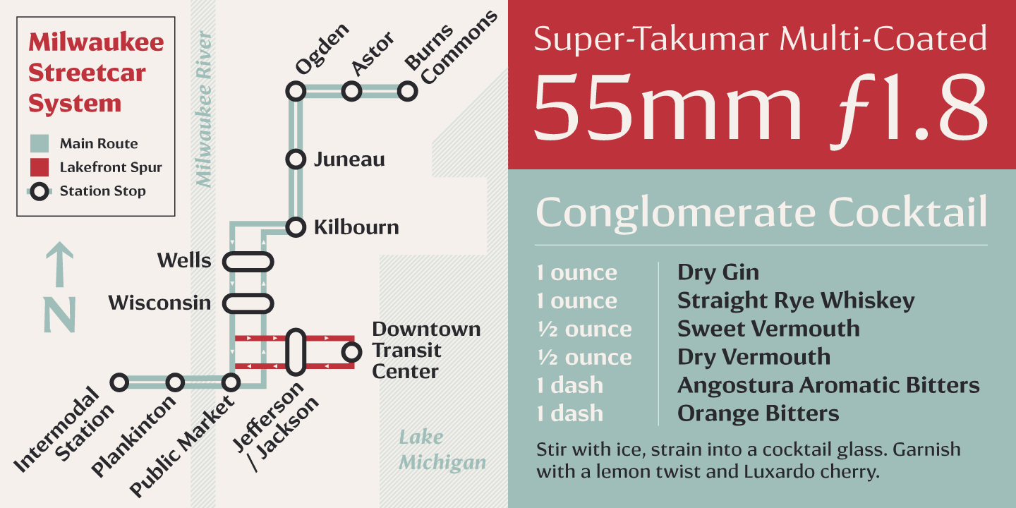
Conglomerate
Sans or serif? Square or rounded? Calligraphic or geometric? Conglomerate is both all and none of these things—a subtle yet unorthodox blend of typographic traits. The result is a clean, unique, and versatile font family with large, open counters for legibility in text yet crisp, sharp details that sparkle at display sizes. Conglomerate is sturdy but never stiff, crisp but never stark: Perfect for projects that require a more contemporary feel than either a traditional serif or geometric sans might bring.
All Typetanic fonts are available for print, web, applications, and ePub licensing. Webfonts may be tested free for thirty days; desktop trials are available upon request. To stay current on all things Typetanic, subscribe to Type Network News, our email newsletter featuring font analysis, designer profiles, type and design events, and more.